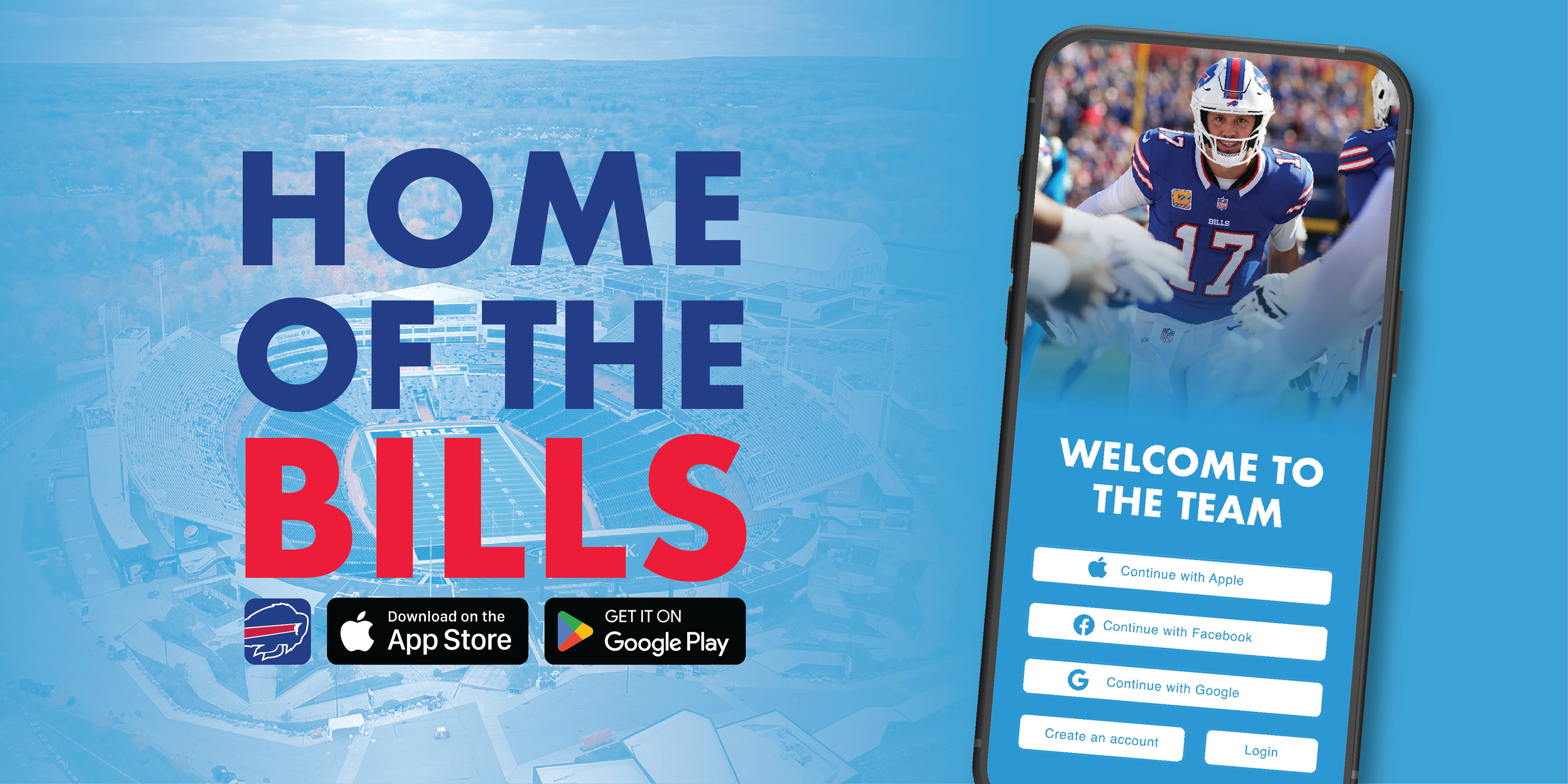
Introduction:
Following your team shouldn’t feel like homework, but too often it becomes a maze of tabs, jumping between websites and multiple apps. I created this app after seeing how frustrated fans get when all they want is a clean snapshot of how their team stacks up. It seems small, but having clear, trustworthy information changes how we watch, react, and talk about the game. This app delivers clear and simple, streamlined insights so fans can stay informed without dedicating all their time.
User Insights:
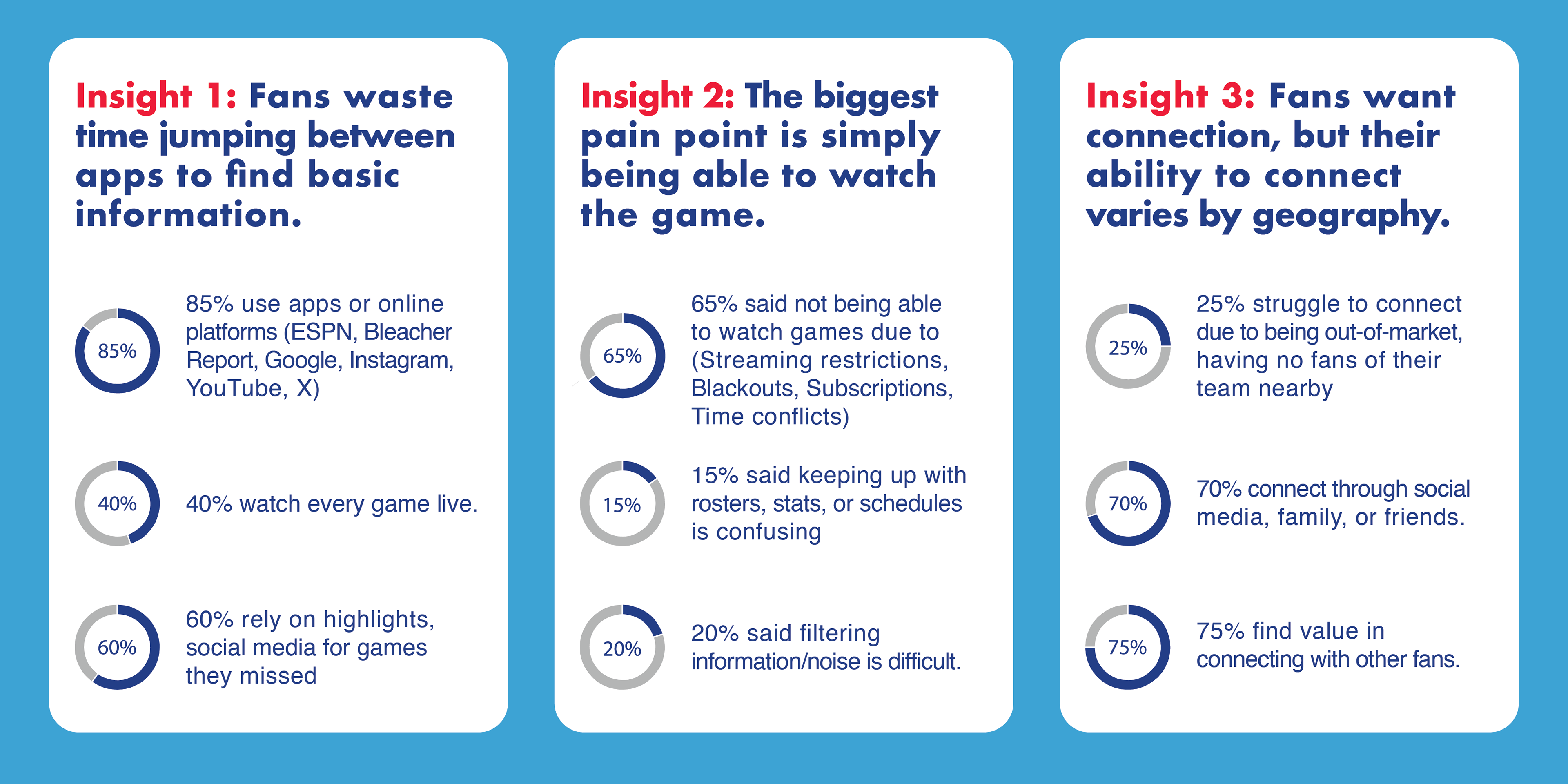
The first step for this was interviewing a variety of fans. I interviewed 20 people to understand their experience with being a fan of a team. The goal was to get deeper insights into the most frustrating parts of supporting a team.
Value Proposition:
Interviewing 20 fans made one insight stand out more than anything else: people love their teams, but they don’t have the time to keep up with them. Fans don’t need more content — they need quicker, simpler, and more reliable access to the information that matters. They want to stay connected to their team even when life gets busy. Through these insights, we defined our value proposition: Our app helps Buffalo Bills fans who have limited time and want to support their team.
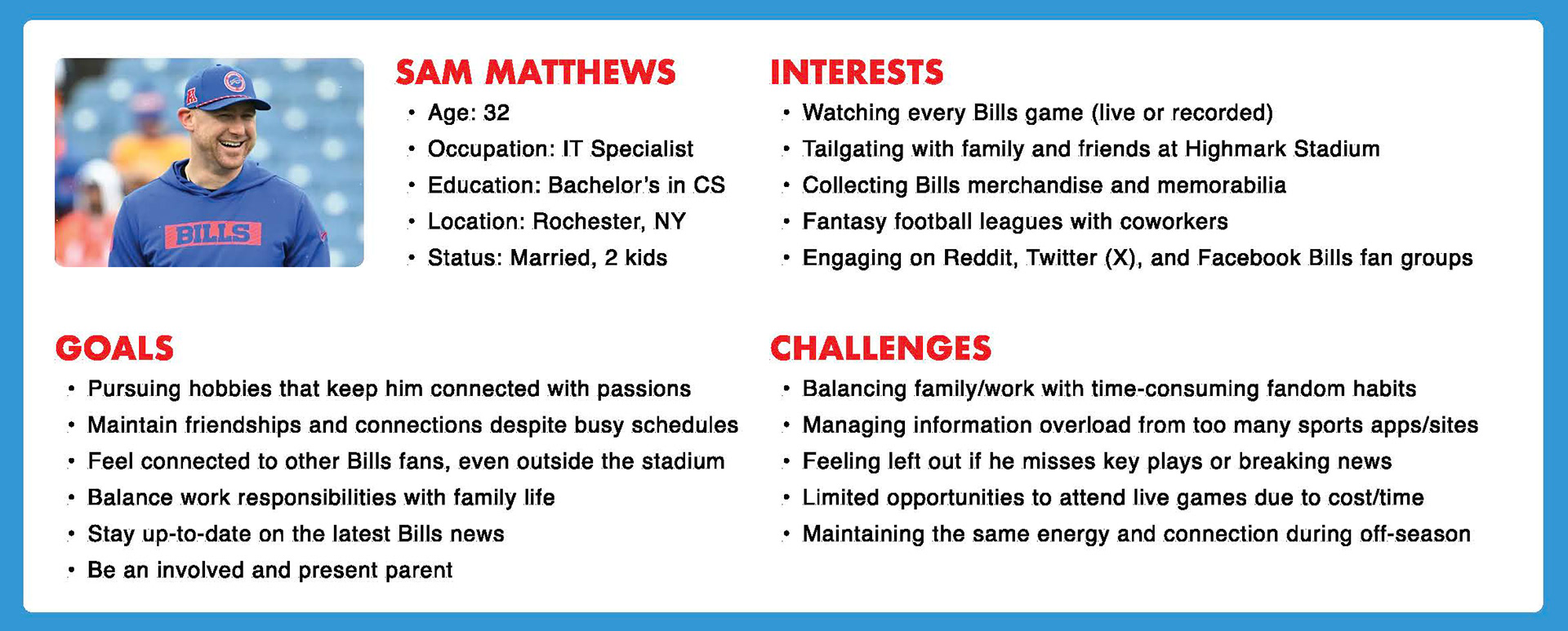
User Persona:
Creating this user persona was essential in shaping the direction, priorities, and overall purpose of the app. By defining Sam Matthews—a busy, family-oriented Bills fan who wants to stay connected without wasting time—we gained a clear, human lens through which to evaluate every feature and decision. This persona ensures that the app remains grounded in user needs, not assumptions, guiding us toward a more meaningful value proposition and a product that genuinely supports fans like him.
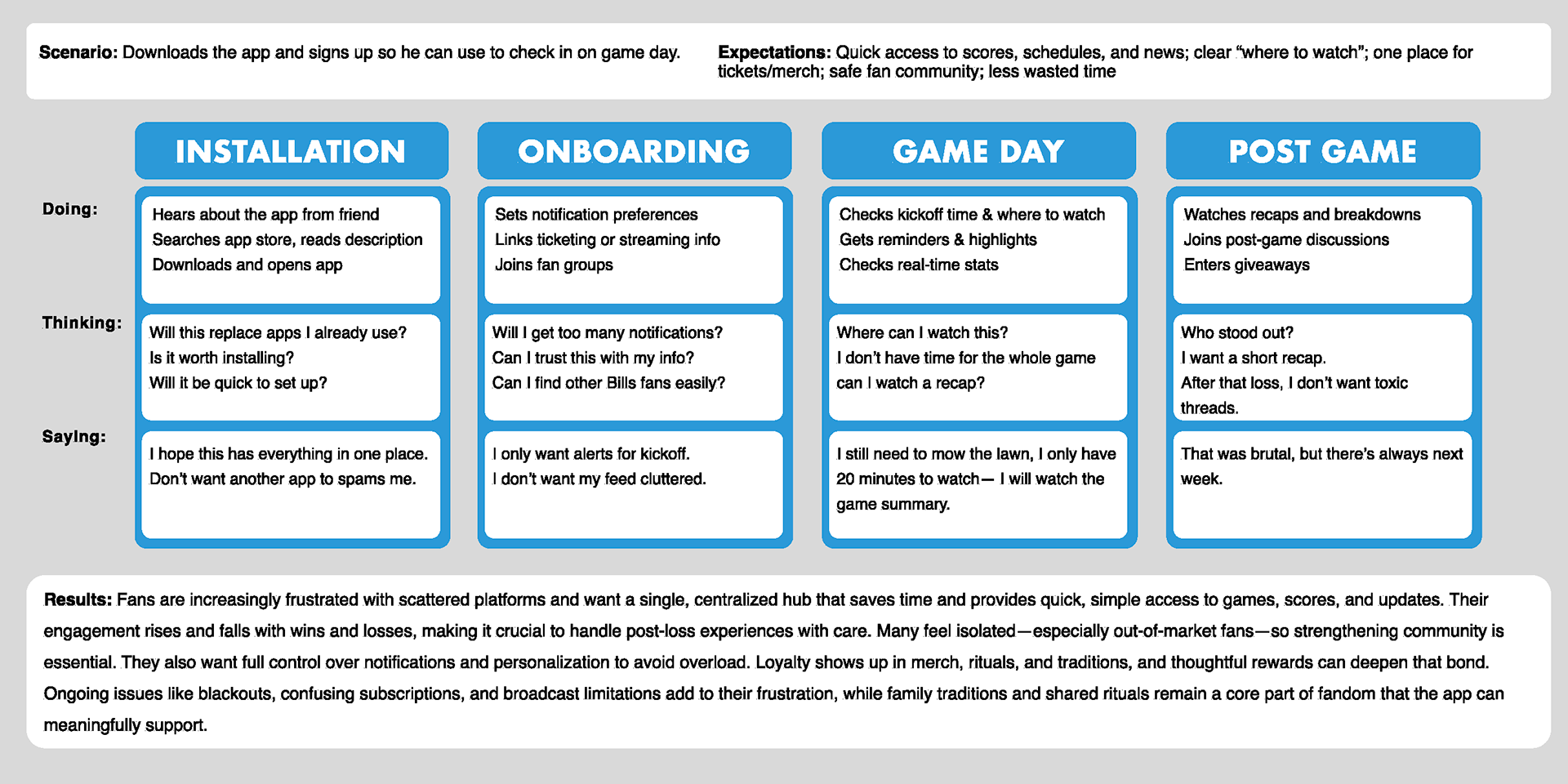
Journey Map:
Diving further into our user persona, mapping Sam’s journey—from first hearing about the app to post-game engagement—revealed exactly where our product needs to remove friction and create value. His scenario is simple: he downloads the app so he can quickly check in on game day. But beneath that simplicity is a series of expectations shaped by frustration with scattered platforms, confusing subscriptions, and the constant search for trustworthy information. The journey map helps us visualize what Sam is doing, thinking, and saying at each stage—installation, onboarding, game day, and post-game.
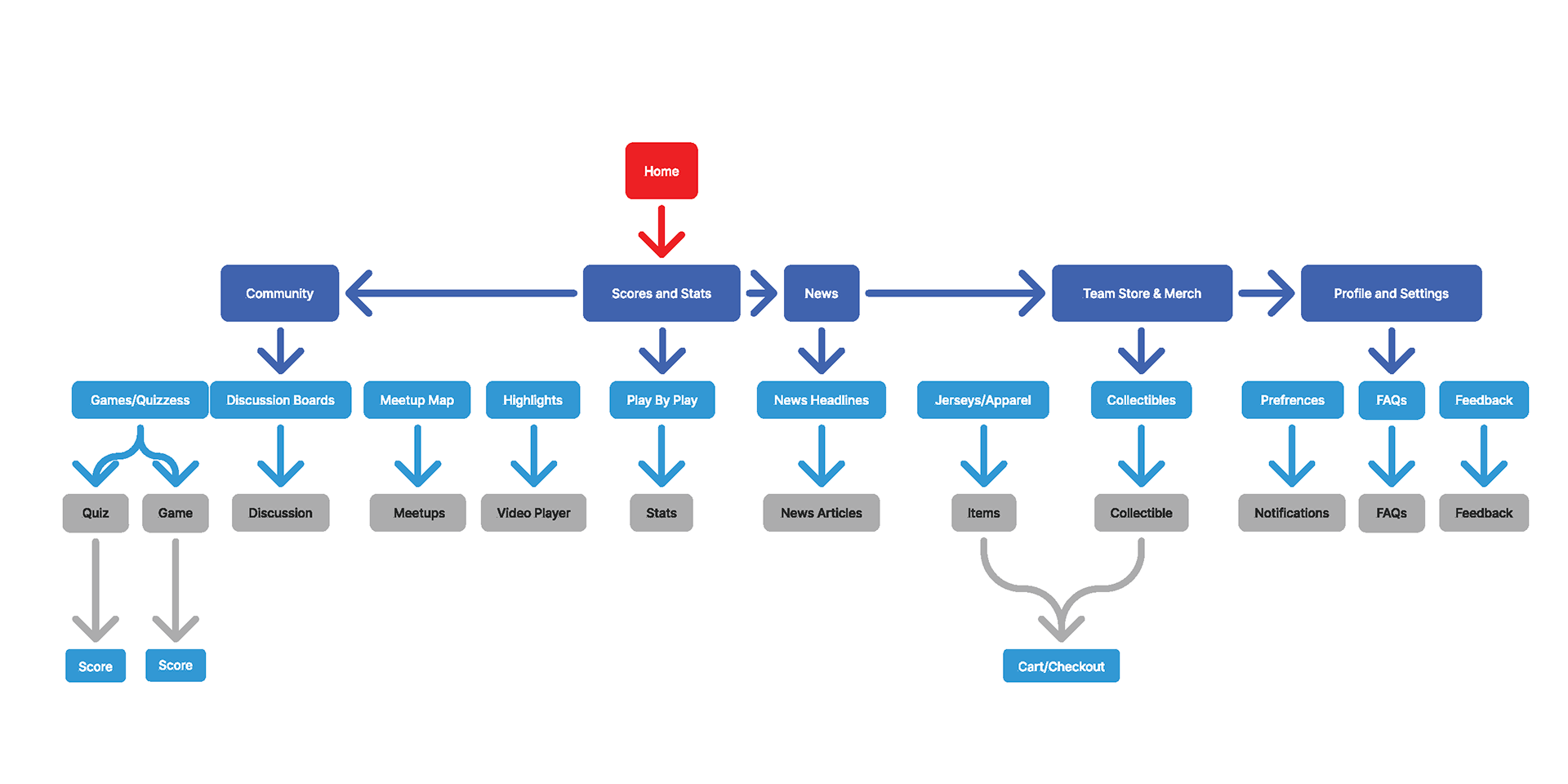
Site Map:
After completing research and diving into the user persona to best understand how to help solve their problems, I created a site map. This helps to simplify the user's experience and spot any early potential navigational problems.
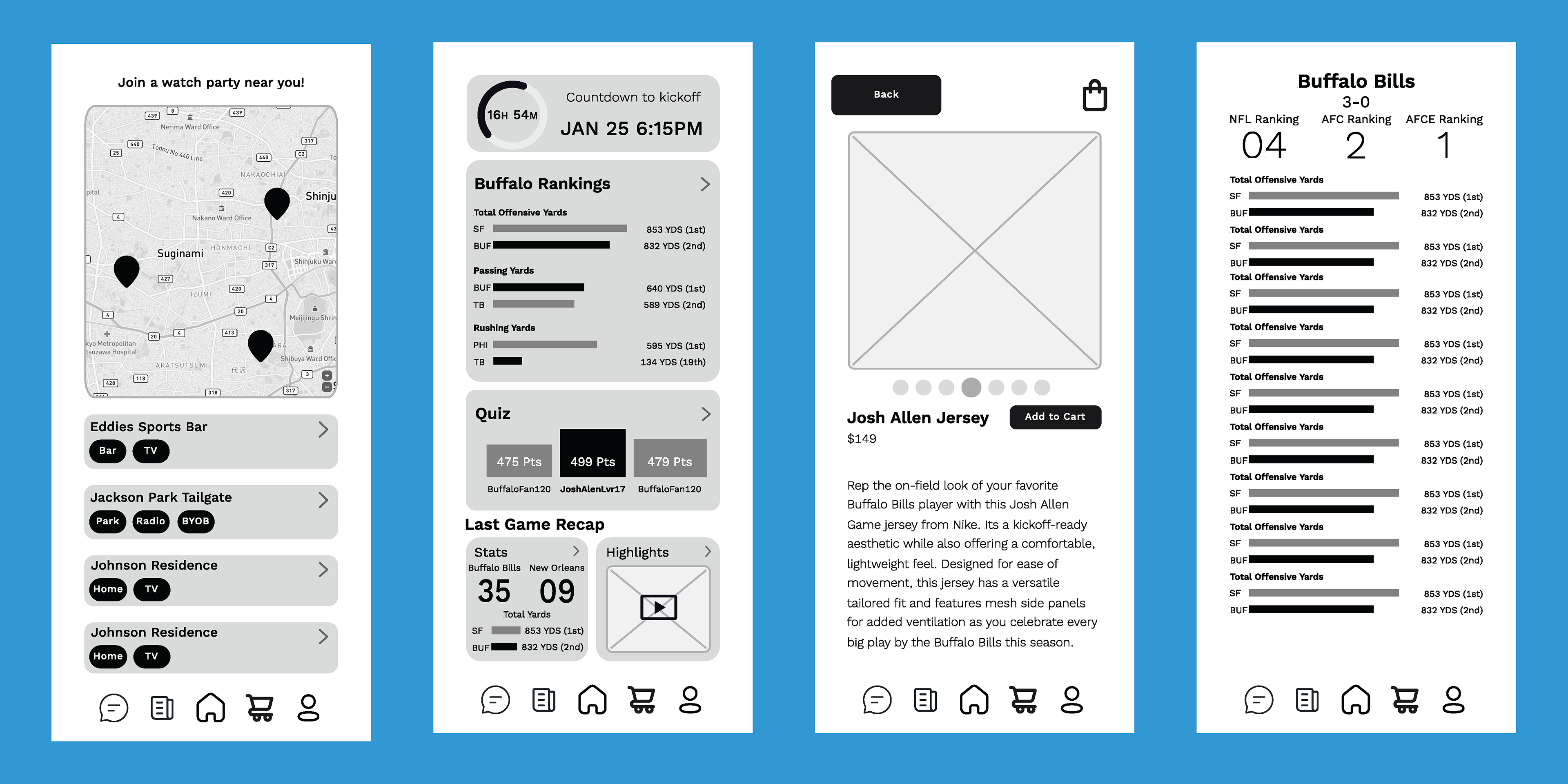
Wire Frame:
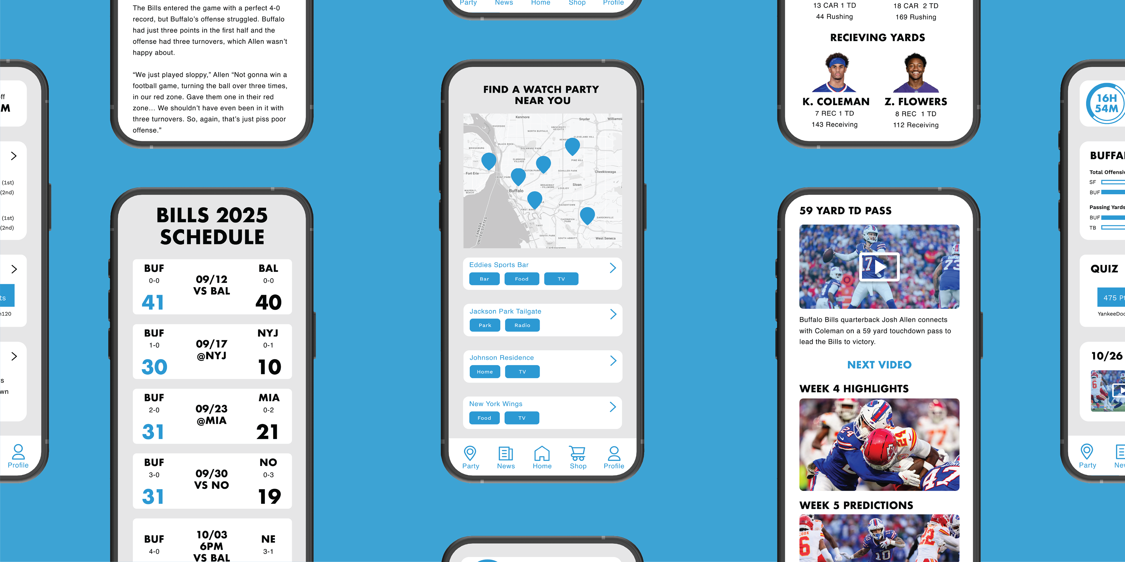
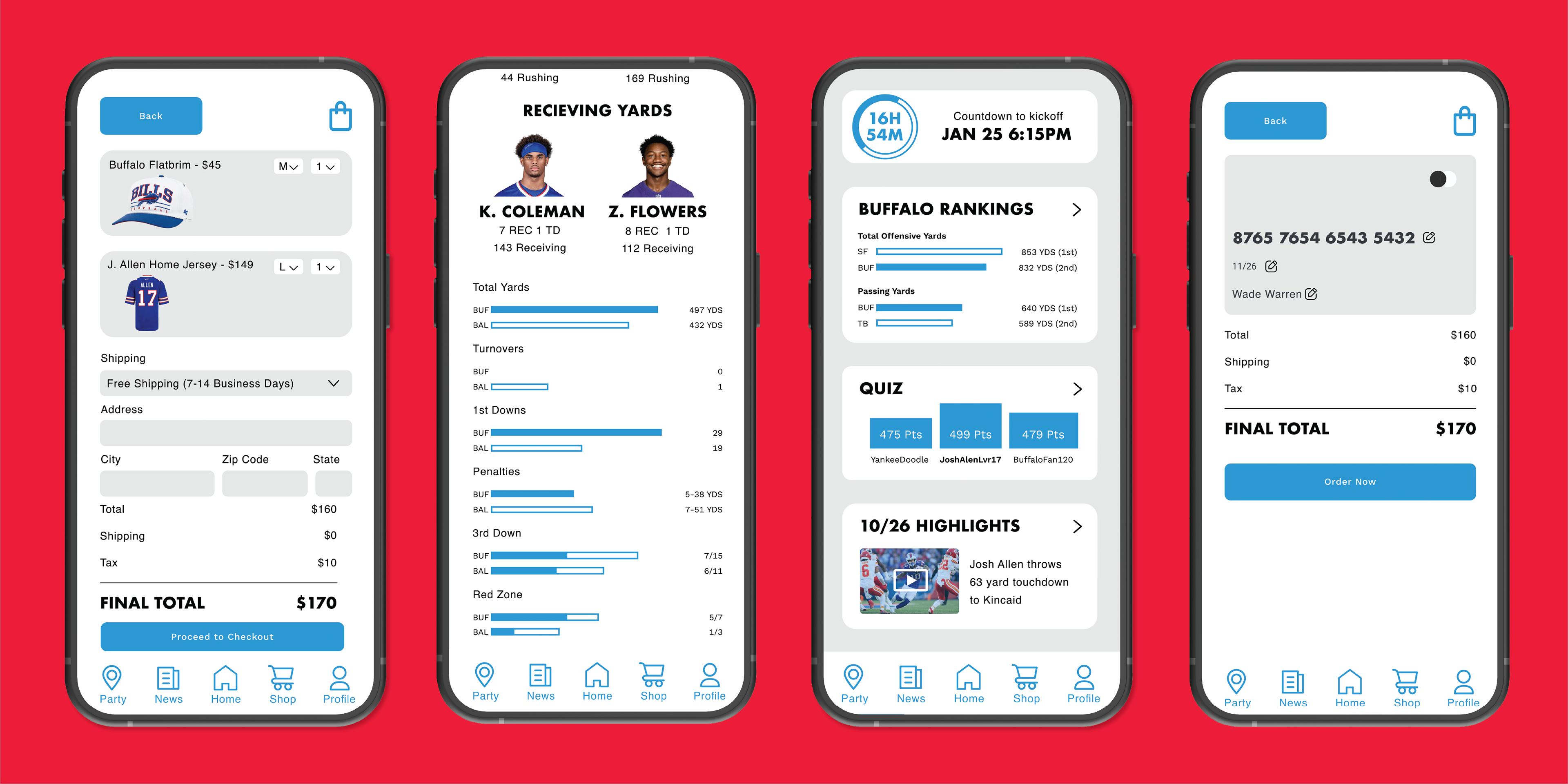
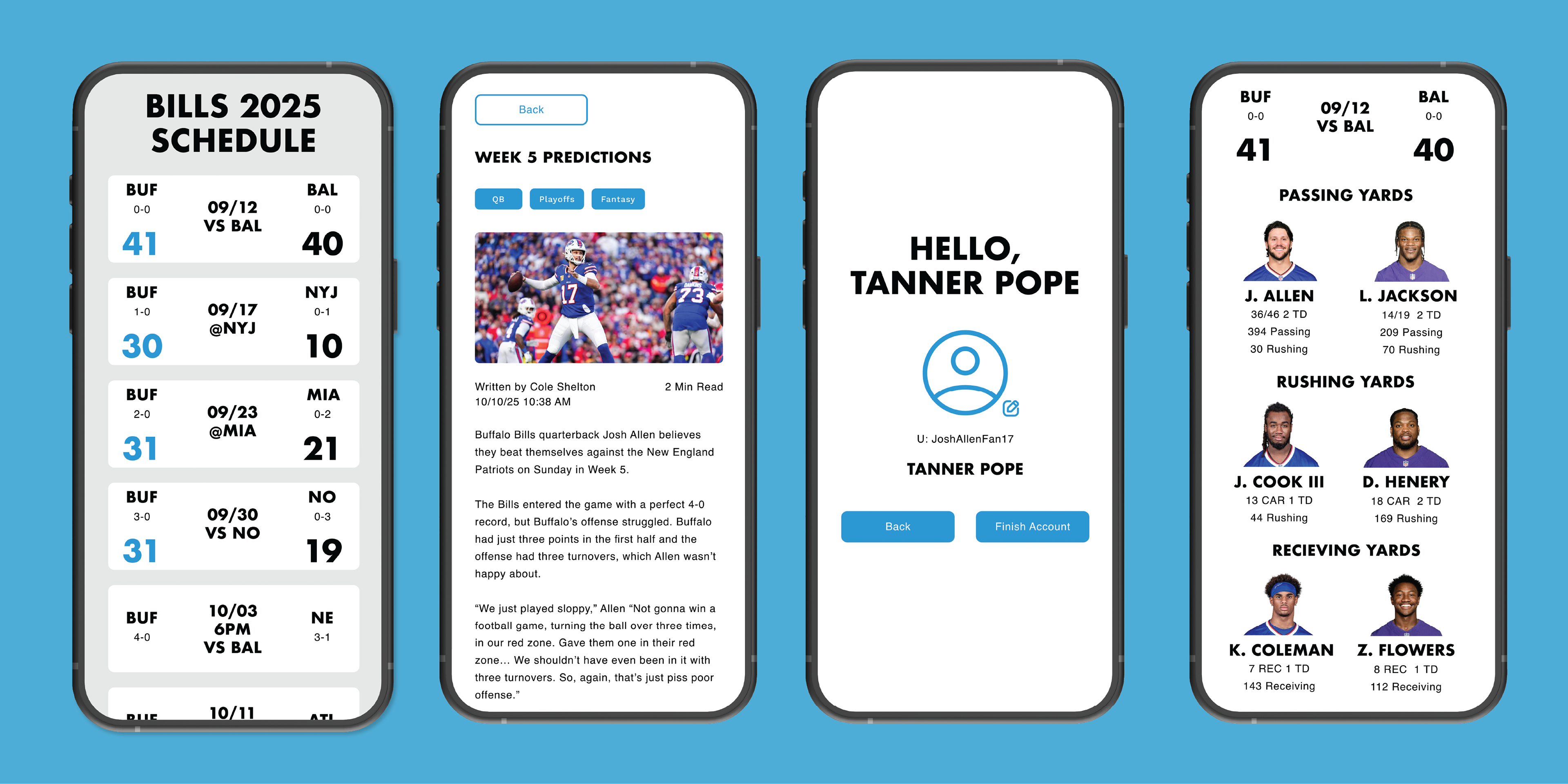
The wireframe was built directly from user insights, prioritizing speed, clarity, and simplicity. Every screen is structured to give fans immediate access to the essentials: scores, schedules, and bite-sized recaps. The layout avoids unnecessary clutter, creating a streamlined flow from onboarding to game-day usage and post-game discussion. Clear hierarchy, bold typography, and intuitive navigation ensure that time-limited users like Sam can get what they need in seconds, not minutes.
Mood Board:
The mood board establishes the visual personality of the app—bold, energetic, and fan-forward—while maintaining high legibility for quick-glance interactions. Inspired by the intensity of game day, it uses strong blues and reds, sharp contrasts, dynamic textures, and elevated sports photography to evoke excitement without overwhelming the interface. The tone balances hype with clarity, ensuring that even during emotional highs and lows, the experience feels grounded and approachable. The mood board serves as a visual guide that keeps the design confident, cohesive, and unmistakably built for passionate Bills fans.
User Testing:
The final step was to perform user testing to see how users would interact with the app. I had 3 tasks for the users to complete, and then they were interviewed about their experience with completing the tasks. I found that people were able to easily navigate onboarding and set up, and read articles, but that the shopping and score sections were hard to navigate. I watched them repeat the task and explain which parts were confusing or why the task wasn’t completed. The user testing led me to change my navigation by creating easier-to-recognize buttons.
Next Project or Return Home
Jester's Head Branding
Unlocking Creativity